

What Quiet Luxury Actually Means in a Room
Quiet luxury is not a trend.
It arrived as one — a phrase attached to a particular palette, a particular silhouette, a particular moment in fashion and interiors that peaked somewhere between 2022 and 2024. And like all trends that attach themselves to an idea rather than a product, it left something behind when the moment passed: a question worth answering properly.
What does quiet luxury actually mean in a room? Not as an aesthetic reference. Not as a Pinterest category. As a genuine philosophy for the objects you choose to live with.
Here is my answer.
WHAT IT IS NOT
Quiet luxury is not neutral colours and expensive materials.
This is the version most often sold under the name — pale walls, linen, cashmere, travertine, the suggestion of restraint through the absence of pattern or colour. It is not wrong, exactly. But it is a surface reading. A room decorated in this way can still be entirely without conviction. The objects can still be interchangeable. The surfaces can still tell you nothing about the person who chose them.
That is not quiet luxury. That is quiet.
Quiet luxury requires objects that have earned their place — not objects that are simply inoffensive enough to remain. It requires provenance, not just quality. It requires permanence, not just material value. And it requires the courage to choose something specific rather than something safe.

WHAT IT ACTUALLY IS
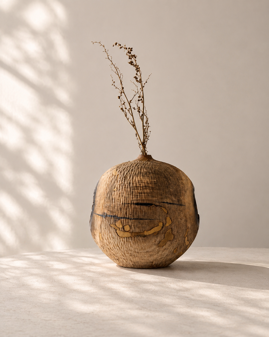
The Tiamtree Carved Vase is quiet luxury.
Not because it is neutral in colour — though it is dark and restrained. Not because it is made from an expensive material — though Korean black persimmon is genuinely rare. But because it is irreplaceable, finite, and specific. Because the patterns in the wood formed over decades before the artist ever touched it. Because every carved line represents a decision that cannot be undone. Because when you place it in a room, it changes the room — not by demanding attention, but by holding its ground with a presence that most objects simply do not have.
This is what quiet luxury feels like from the inside. An object so particular, so honest about what it is and how it came to be, that it makes the room more interesting simply by existing in it.

THE MATERIAL ARGUMENT
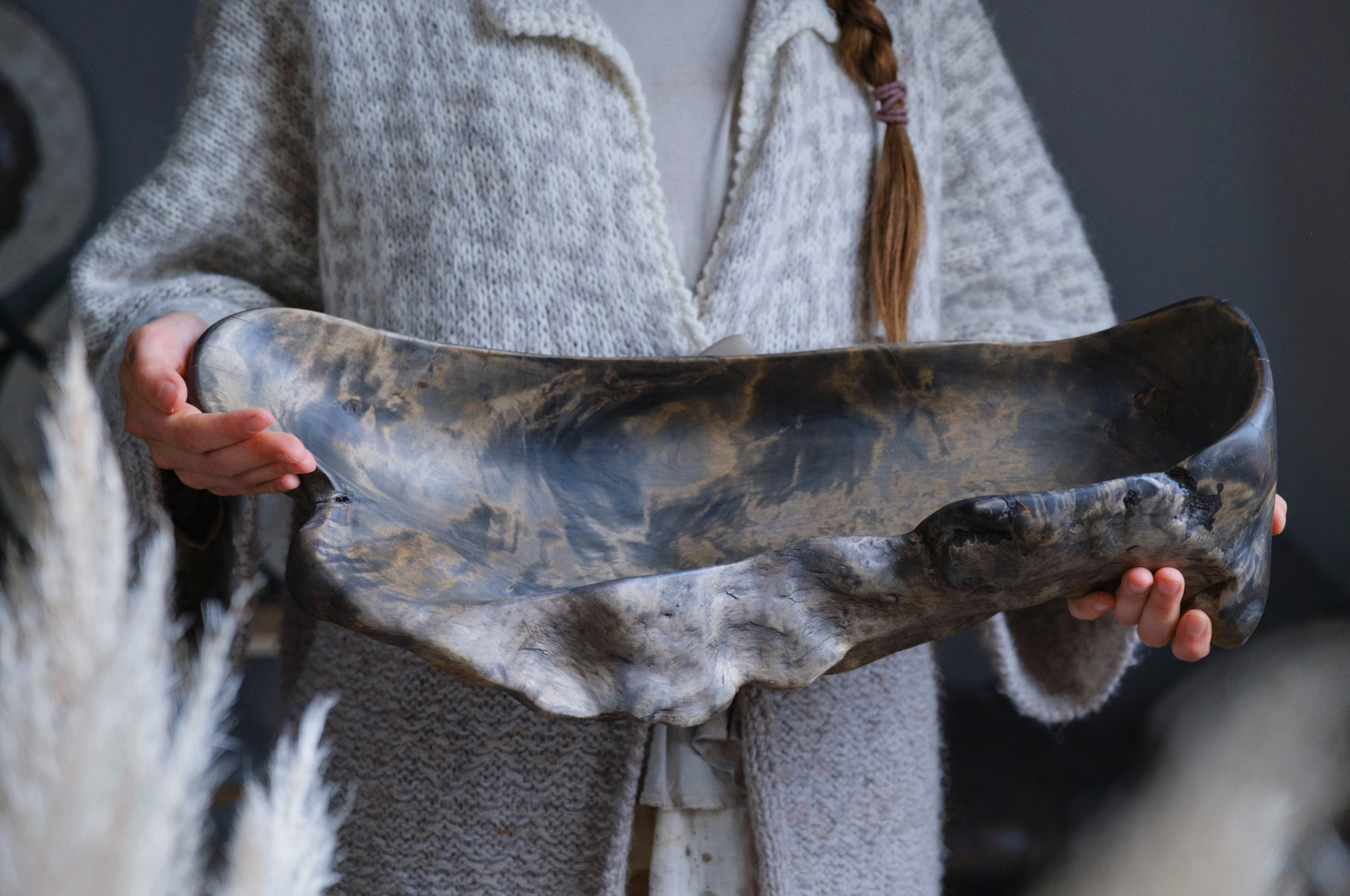
The Obika Wooden Crafted Bowl makes the same argument in a different material.
Solid chestnut, sourced from fallen trees in Latvia by a husband-and-wife team who have been working with naturally aged wood for years. Ebonised using an ancient technique — iron-rich solution reacting with the wood's natural tannins, darkening the grain to a depth that no stain or paint can replicate. Triple-waxed, food-safe, 48 centimetres of form that was already in the tree before anyone touched it.
Place the Obika Bowl on a coffee table and it does not announce itself. It settles. It occupies the surface in a way that makes the table feel considered rather than furnished. The material contrast principle applies here directly: the ebonised chestnut beside a pale ceramic or a light-toned surface creates the kind of tension the eye wants to resolve — and keeps resolving, differently, every time.
This is the material argument for quiet luxury: not what the object is made of, but what the material has been through before it arrived in your home.

THE PARIS EXCEPTION
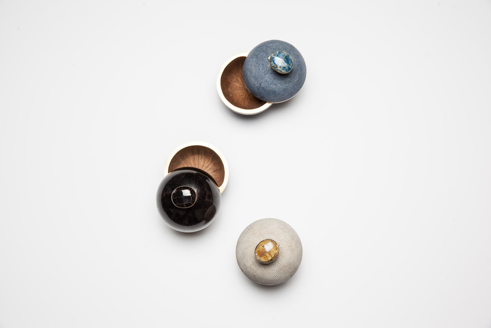
The Cream Egg Box Canister is the piece in August's edit that most people will not immediately identify as quiet luxury — and the piece that most precisely demonstrates what it means.
It is handcrafted in Paris. Cream pen shell — a natural material with a luminescence that no synthetic surface replicates — wrapped around a curvaceous egg-like form, finished with brushed brass trim. 13 centimetres. A hidden compartment. The kind of object that rewards proximity: the closer you are to it, the more it reveals.
On a shelf beside the Tiamtree Vase — organic dark wood beside luminous pale shell — the Contrast principle operates at its most complete. Two objects from entirely different material worlds, in conversation without competing. Neither announces itself. Both change the surface they occupy.
That is quiet luxury. Not restraint for its own sake. Contrast that has been chosen rather than happened upon.

THE LIMITED EDITION QUESTION
The Limited Edition Aztec Oversized Ginger Jar is the boldest piece in August's edit — geometric, blue and white, the Aztec motif hand-etched across hand-thrown porcelain — and the one that might seem to sit outside the quiet luxury argument.
It doesn't. And the reason it doesn't is instructive.
The jar is bold in pattern but not in volume. It makes its presence felt through visual complexity — the hand-etched motif that reads differently in every light — rather than through scale or noise. The polished brass trim catches the light quietly. The limited edition status means this particular combination of scale and motif will not be made again.
Quiet luxury does not require neutral colour. It requires that the object know what it is, and that the person who chose it knew why they chose it. The Aztec Jar passes both tests.
THE RULE
Quiet luxury is objects chosen for permanence, not performance.
It is the difference between a room that looks expensive and a room that feels considered. The first communicates money. The second communicates taste — which is harder to achieve and more interesting to be in.
Every piece in the August NH edit is quiet in this specific sense. Not visually quiet — though several are. But honest. Specific. Earned. The kind of objects that, in five years, still make sense on the surface they occupy. In ten years, make more sense. In twenty, have become part of the room's identity.
That is the long view. And the long view is what quiet luxury, properly understood, has always been about.

Comments